Have you ever grappled with the art of color mixing and found yourself dissatisfied with the results? Mixing the perfect color can be a complex task, whether you’re painting a portrait, crafting a landscape, or engaging in any artistic endeavor. Understanding the fundamentals of color theory and having a step-by-step guide to follow can greatly improve your outcomes.
Understanding Color Theory
Before diving into the specifics of color mixing for different scenarios, it’s crucial to start with the basics of color theory. This foundational knowledge will guide your decisions and improve your artistic skills.
Primary, Secondary, and Tertiary Colors
Colors are the backbone of any artwork. Understanding the hierarchy of colors—primary, secondary, and tertiary—is essential when mixing pigments.
- Primary Colors: These are colors that cannot be created through the mixing of other hues. The primary colors are red, blue, and yellow. These form the basis for creating all other colors.
- Secondary Colors: By mixing equal parts of two primary colors, you obtain secondary colors. Examples include:
- Red + Blue = Purple
- Blue + Yellow = Green
- Yellow + Red = Orange
- Tertiary Colors: These are made by mixing a primary color with a secondary color, which results in hues like red-orange or blue-green.
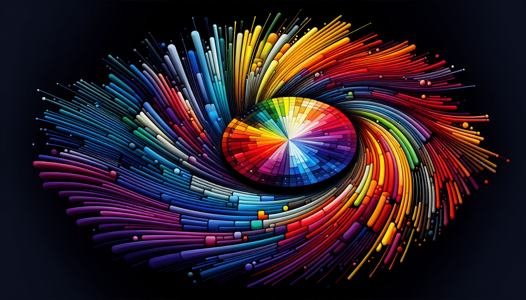
The Color Wheel
The color wheel is an invaluable tool for artists. It visually represents the relationships between colors and helps in understanding how different hues interact with each other. When mixing colors, the position of a color on the wheel can influence the outcome.
The Role of Complementary Colors
Complementary colors are opposite each other on the color wheel and have a contrasting effect. When mixed, they tend to neutralize each other and create a more muted tone. For example, mixing red with green will result in a brownish color.
The Impact of Value and Saturation
- Value: Refers to the lightness or darkness of a color. Manipulating value is crucial when creating depth or dimension in your work.
- Saturation: Indicates the vibrancy of a color. High saturation yields vivid colors, while low saturation results in more subdued tones.
With this foundational knowledge, you’re better equipped to tackle specific color mixing challenges based on the subject matter of your artwork.
Mixing Colors for Portraits: Achieving Realistic Skin Tones
Depicting skin tones accurately is one of the most challenging but rewarding aspects of portrait painting. Human skin has diverse tones and nuances that need careful consideration to render effectively.
Identifying the Base Skin Tones
Before mixing colors, identify the base skin tone of the subject. This involves observing whether the skin has a warm, cool, or neutral undertone. Each of these undertones will influence the colors used in the mix.
Step-by-Step Guide to Mixing Skin Tones
-
Determine the Undertone:
- Warm Undertone: Typically, these skins have a yellow or peach base.
- Cool Undertone: These tend to have a pink or blue base.
- Neutral Undertone: A balance between warm and cool, often having an olive shade.
-
Choose Your Base Colors:
- Use primary colors such as red, yellow, and blue as your base.
- For lighter skin tones, start with a more significant proportion of white.
-
Mixing Process:
- Begin with the dominant color based on the undertone identified.
- Gradually add secondary colors to adjust the tone. For example, if the skin has a warm undertone, you might start with red and yellow, then add blue to tone down to your desired shade.
- Use white to lighten the mix if necessary.
-
Adjust Variations:
- To create highlights, incorporate more white or yellow.
- For shadows, use a complementary color or a touch of a darker hue like burnt umber.
-
Final Adjustments:
- Fine-tune the color by adding small amounts of red or blue to achieve the exact match.
Common Mistakes in Mixing Skin Tones
- Overuse of Red or Yellow: Can lead to unnatural, overly warm hues.
- Avoiding Blue: Adding a hint of blue can deepen the tone and prevent an overly orange or pink outcome.
- Ignoring Undertones: Not recognizing undertones can result in flat or unrealistic skin colors.

Achieving Lifelike Landscapes: Color Mixing for Nature Scenes
When painting landscapes, translating the vibrancy and diversity of nature onto canvas involves mastering your color mixing skills.
Understanding the Dominant Colors
Landscapes often feature key components like sky, water, foliage, and earth. Identifying the dominant colors in each of these elements is the first step in your mixing process.
Step-by-Step Landscape Mixing Guide
-
Sky:
- Begin with a base of blue for clear skies (ultramarine or cerulean).
- Add white to lighten the sky toward the horizon.
- Incorporate hints of red or yellow for sunrise or sunset effects.
-
Water:
- Use variations of blue and green as the primary base.
- Add touches of white for reflections or movement.
- For ocean scenes, consider deeper blues mixed with green or gray hues.
-
Foliage:
- Start with a mix of yellow and blue to create a base green.
- Adjust with more yellow for sunny highlights or more blue for shaded areas.
- Incorporate brown or burnt sienna for earthy, muted backdrops.
-
Earth/Soil:
- Utilize a combination of red, yellow, and blue to create a range of browns.
- Adjust saturation and value to reflect sunlight and shadow variations.
Tips for Capturing Nature’s Nuances
- Observe Light Source: The direction and quality of light can drastically affect the color of landscape elements.
- Seasonal Changes: Recognize how seasons alter the color palette, from the lush greens of summer to the muted tones of winter.
- Experimenting with Texture: Applying mixed colors using different techniques (dry brush, glazing) can enhance the realism of textures like leaves or water ripples.
Creating Diverse Color Palettes for Different Artistic Styles
Beyond realism and representation, you might be interested in exploring broader styles. Understanding how to mix colors for these diverse styles can open up new creative opportunities.
Impressionism
In Impressionism, the focus is on capturing the immediate impression of a scene rather than its details.
- Palette Focus: Utilize pure colors and mix them directly on the canvas.
- Brushstroke Technique: Short, thick strokes of paint capture form and light.
Abstract Art
Abstract art often utilizes bold color schemes to evoke emotion or conceptual ideas.
- Layering and Blending: Experiment with overlapping colors to create new shades and textures.
- Avoid Realism: Use unlikely color combinations to break free from representational instincts.
Pop Art
Pop Art features vibrant hues and often playful subject matter.
- High Contrast Colors: Using bright and saturated colors such as red and yellow can create striking visuals.
- Limited Blending: Maintaining distinct boundaries between colors to replicate the clean, graphic style often seen in pop art.

Practical Tips for Successful Paint Mixing
To ensure effective paint mixing, a combination of preparation, technique, and personal understanding is crucial.
Essential Tools
Having the right tools can make a significant difference in the mixing process.
- Palette: Opt for a palette large enough to allow space for multiple mixtures.
- Palette Knife: A palette knife helps in mixing paint evenly and is easier to clean than brushes.
- Brush Variety: Use a variety of brushes for different tasks, including fine-tuning your color mixes.
Efficient Mixing Techniques
- Controlled Ratios: Carefully measure pigment amounts when mixing to reproduce consistent colors.
- Keep Colors Clean: Avoid muddy mixes by cleaning tools between colors.
Avoiding Common Pitfalls
- Test on Paper First: Before applying a mix to your final canvas, test colors on a scrap piece to ensure satisfaction.
- Moderation in Mixing: Use additional pigments sparingly to avoid overpowering your base color.
Conclusion
Color mixing is a journey that requires practice, patience, and a foundational understanding of color theory. Whether you are painting skin tones, landscapes, or experimenting across different styles, mastering the art of mixing is an invaluable skill for every artist. By adhering to structured guidelines and experimenting with techniques, your color mixing will elevate the quality and impact of your artwork. Whether creating lifelike realism or vivid abstract pieces, your command over colors will be your most powerful artistic tool.