Have you ever wondered how to elevate your color mixing skills beyond the basics to enhance your artistic or design projects? Understanding advanced color mixing techniques is essential for artists and designers who are looking to refine their work. This article will guide you through complex color concepts that can help you create more captivating and harmonious compositions.

Understanding the Importance of Color Mixing
Color mixing is more than just blending colors to achieve a desired hue. For artists and designers, mastering advanced color mixing techniques can be pivotal in creating depth, mood, and emphasis in their work. It allows for more precise communication through visual mediums, ensuring that the intended message or aesthetic is successfully conveyed to the audience.
The Science of Color
Before diving into advanced techniques, it’s crucial to understand the science behind color. Colors result from the way light interacts with objects. The colors we perceive are determined by the wavelengths of light that objects reflect. Objects absorb other wavelengths, which is why different objects appear in various colors. By knowing this, you can better predict how different combinations of colors will interact on a canvas, screen, or in print.
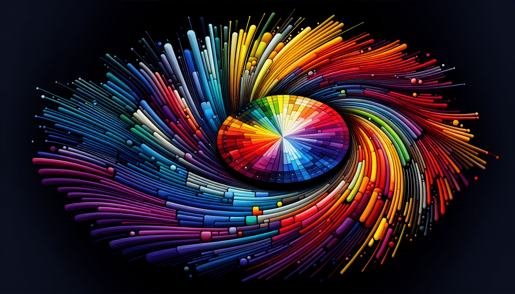
Advanced Color Wheels: A Closer Look
Most are familiar with the basic color wheel, but advanced color wheels introduce more complexities by incorporating additional hues, tints, and shades, offering a broader spectrum to work with.
The CMY and CMYK Wheels
Unlike the traditional RGB color model used in digital screens, the CMY (Cyan, Magenta, Yellow) model is pivotal for artists who work with pigments, such as those involved in printing, painting, and other physical media. The CMYK (Cyan, Magenta, Yellow, Key/Black) adds complexity for print works by incorporating black, which is crucial for achieving deeper tones efficiently.
The Extended Color Wheel
An extended color wheel includes secondary and tertiary colors, offering nuances that allow for richer, more intricate color palettes. By adding these additional layers, artists and designers can create transitionary colors that maintain harmony within a design or artwork.
The Technique of Layering in Color Mixing
The strategy of layering involves applying multiple semi-transparent layers of color to build up tone and texture. This approach lends depth and richness to your work that flat applications can’t achieve. Layering allows for organic shifts in hue and value that are reminiscent of natural light and shadow.
Practical Steps for Effective Layering
- Preparation: Begin with a base layer of primary colors, ensuring each layer dries before applying another to prevent muddiness.
- Building Up: Gradually apply subsequent layers, starting with lighter tones and progressing to darker ones, allowing the transparency of the paint to alter the appearance of the hues beneath.
- Experimentation: Experiment with different mediums (such as glaze or gel medium) to change the transparency and texture of each layer.
Exploring Optical Mixing
Optical mixing involves placing small dots or strokes of different colors next to each other, allowing the viewer’s eye to blend them when viewed from a distance. This technique is famously employed in Pointillism and can create shimmering effects and unique texture in artistic works.
How to Use Optical Mixing
- Color Patches: Try using patches of pure colors to create vibrant mixes without directly blending the colors.
- Spatial Awareness: Manipulate distance between color placements to impact how the colors blend to the viewer. More space between strokes will soften the blending effect.

Understanding Color Context
Colors can look completely different depending on their surroundings. Understanding color context is essential for creating compositions where colors balance and enhance one another rather than clash.
The Role of Surrounding Colors
- Adjacent Colors: Colors placed next to each other can alter your perception of them. A grey color might appear warmer or cooler based on the colors around it.
- Contrast and Harmony: Pay attention to how high-contrast colors can make an element stand out, whereas harmonious colors blend smoothly.
Advanced Tinting and Shading Techniques
Creating depth and perspective in your work often involves complex tinting and shading. It’s not just about adding white or black but also understanding color temperature and contrast to create more dynamic and realistic images.
Techniques for Enhanced Tinting and Shading
- Temperature Awareness: Use warm tints in areas meant to catch light, and cooler shades in shadow areas to enhance three-dimensionality.
- Complementary Colors: Incorporate complementary colors in shadows instead of neutrals for a more vibrant effect.
Mastering Color Harmony
Achieving color harmony goes beyond choosing colors that look good together; it involves deliberate planning and understanding of how colors interact to create a balanced and aesthetically pleasing composition.
Strategies for Achieving Color Harmony
- Analogous Color Schemes: Use colors that are next to each other on the color wheel for subtlety and coherence.
- Triadic Schemes: Utilize three colors that are evenly spaced around the color wheel for dynamic yet balanced effects.
- Split Complementary Schemes: This offers the drama of complementary colors with less tension.
Emotional Impact of Colors
Each color can evoke different emotions and responses. Understanding the psychological impact of color choices is crucial for artists and designers aiming to convey specific messages or moods.
Emotional Associations with Colors
- Red: Energy, passion, attention
- Blue: Calmness, stability, tranquility
- Yellow: Happiness, warmth, alertness
- Green: Growth, serenity, freshness
- Purple: Luxury, spirituality, creativity
Incorporating Neutrals for Balance
Neutrals are often underestimated in their ability to influence a composition. Using a range of whites, greys, and blacks can significantly affect the overall impact of your work, acting as a rest for the eye and enhancing surrounding colors.
How to Use Neutrals Effectively
- Accentuating Colors: Use neutrals to allow vibrant colors to stand out without competing elements.
- Creating Contrast: Neutrals can serve as contrasting elements that add depth and intrigue without overwhelming the primary colors.
Case Studies in Advanced Color Mixing
Examining case studies of well-known artworks or designs can provide inspiration and insight into how advanced color techniques can be applied in your own work.
Case Study Example
Van Gogh’s Starry Night
Vincent Van Gogh’s “Starry Night” is an excellent example of how color contrast and complementary colors contribute to the vibrancy and emotional impact of a work. The swirling shades of blue and vibrant yellows create a sense of movement and drama that has captivated audiences for generations.
Conclusion
Elevating your color mixing techniques beyond the basics involves understanding detailed concepts such as color theory, optical mixing, and the psychological implications of colors. By incorporating these advanced strategies, you can enhance the depth, emotion, and harmony in your artistic and design projects. Whether you are a painter or a digital designer, mastering these skills will undoubtedly add sophistication and impact to your work.