Have you ever wondered how colors can influence the mood of a painting or the overall aesthetic of a space? Understanding color theory is essential for artists and DIY painters alike, as it lays the foundation for effective color use in your works. Mastering this theory not only enhances your artistry but also helps you create visually appealing spaces in your home or any environment you wish to transform.
Introduction to Color Theory
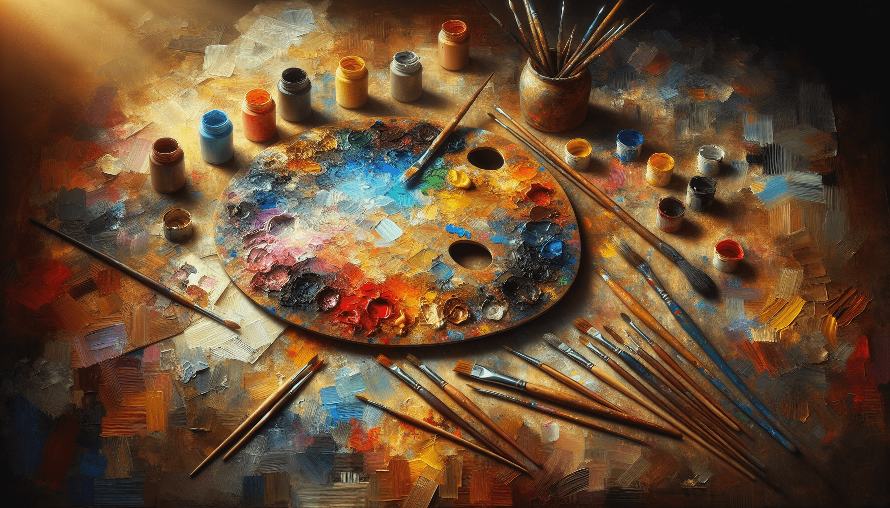
Color theory is a set of principles used to understand how colors interact with each other. It serves as a guide for artists and painters to use colors effectively and harmoniously. As you learn about color theory, you will discover how to create combinations that evoke emotions, highlight specific elements, and achieve a cohesive look.
Why Is Color Theory Important?
Understanding color theory is pivotal for various reasons:
- Creativity Enhancement: It opens up new avenues for artistic expression by allowing you to see color relationships dynamically.
- Visual Impact: Effective color choices can transform ordinary spaces or artwork into captivating experiences.
- Improved Communication: Colors communicate feelings and intentions, and knowing how to use them skillfully can help convey your message more effectively.
The Color Wheel: Your Essential Tool
The color wheel serves as an indispensable reference when learning about color relationships. It organizes colors logically, showcasing how they relate to one another based on traditional color theory.
Primary Colors
Primary colors are the foundation of the color wheel. They cannot be created by mixing other colors and consist of:
- Red
- Blue
- Yellow
These colors can be mixed in various ways to create a vast array of secondary and tertiary colors.
Secondary Colors
Secondary colors are formed by mixing two primary colors. They include:
- Green (Blue + Yellow)
- Orange (Red + Yellow)
- Purple (Red + Blue)
These colors further expand your palette and offer more options for color mixing.
Tertiary Colors
Tertiary colors result from mixing a primary color with a secondary color. These colors include:
- Red-Orange
- Yellow-Orange
- Yellow-Green
- Blue-Green
- Blue-Purple
- Red-Purple
Understanding these layers of color is crucial for creating depth and complexity in your artwork or home design.

Understanding Color Relationships
Different color relationships create various visual effects and evoke different emotions. By mastering these combinations, you can heighten the impact of your artistic work.
Complementary Colors
Complementary colors are located directly opposite each other on the color wheel. When used together, they create a high contrast that can make artwork vibrant and energetic. Examples include:
- Red and Green
- Blue and Orange
- Yellow and Purple
Incorporating these color combinations can significantly enhance certain elements in your work.
Analogous Colors
Analogous colors are situated next to each other on the color wheel. They typically consist of one dominant color and its neighbors, offering a harmonious appearance. Examples include:
- Blue, Blue-Green, and Green
- Red, Red-Orange, and Orange
Using analogous colors can create a pleasing and serene atmosphere in your artwork or interior spaces.
Triadic Colors
Triadic colors involve three colors evenly spaced around the color wheel. This combination promotes balance while allowing for vibrant contrasts. A common triadic scheme includes:
- Red, Yellow, and Blue
- Green, Purple, and Orange
Utilizing triadic colors can introduce variety and energy to your work without overwhelming the viewer.
Warm and Cool Colors
Colors are often classified into warm and cool categories, which significantly affect the emotional response of the audience.
Warm Colors
Warm colors, such as red, orange, and yellow, evoke feelings of warmth, excitement, and energy. These colors tend to advance in space, drawing attention and creating an inviting atmosphere.
Cool Colors
Cool colors, including blue, green, and purple, promote feelings of calm, serenity, and relaxation. They recede in space, making them ideal for creating a soothing environment.
Understanding these classifications can help you choose the right palette for the mood you wish to convey in your artwork or surroundings.

Color Harmonies: Achieving Balance
Color harmonies refer to the pleasing arrangements of colors used in compositions. By understanding these combinations, you can achieve visually satisfying results.
Monochromatic Harmony
Monochromatic harmony involves using variations of a single color. This includes different shades, tints, and tones of that color. For example, using light blue, medium blue, and dark blue together creates a cohesive and sophisticated look.
Split-Complementary Harmony
Split-complementary harmony consists of a base color and the two colors adjacent to its complementary counterpart. This combination provides contrast while maintaining harmony. For instance, if your base color is blue, its complementary colors, orange, yellow-orange, and red-orange can create dynamic compositions.
Double-Complementary Harmony
Double-complementary harmony employs two pairs of complementary colors. For example, using red and green, as well as blue and orange, can result in an exciting visual balance suitable for more complex pieces.
Color Mixing Guide
Understanding how to mix colors effectively is a crucial aspect of color theory. Knowing how to create specific colors from primary colors allows for greater flexibility in your work.
Basic Mixing Techniques
To achieve the desired hues, a few methods can be applied:
- Additive Mixing: This process occurs when light is combined, as seen on screens. Here, colors blend to create lighter hues. For instance, mixing red and green light results in yellow.
- Subtractive Mixing: Common in painting, subtractive mixing involves blending pigments. This method showcases how colors absorb and reflect light. For example, mixing red and yellow pigments results in orange.
Creating Shades, Tints, and Tones
Understanding how to create shades, tints, and tones will enhance your color palette.
- Shade: Adding black to a color creates a shade, resulting in a darker variant. For instance, mixing blue with black yields a deep navy.
- Tint: Adding white to a color generates a tint, creating a lighter version. Mixing red with white produces pink.
- Tone: Adding grey to a color results in a tone, adjusting its intensity. For example, adding grey to blue can create a softer, more muted version.
Color Mixing Chart
A color mixing chart can be an invaluable tool for visualizing how to create specific hues. Below is a simple guide you can use:
| Primary Color | Mix With | Resulting Color |
|---|---|---|
| Red | Yellow | Orange |
| Red | Blue | Purple |
| Blue | Yellow | Green |
| Yellow | Red | Orange |
| Blue | White | Light Blue |
Practical Applications of Color Theory
Now that you have a grasp of color theory fundamentals, you can apply your knowledge in various artistic and DIY projects.
Painting Techniques for Artists
- Color Blocking: This technique involves applying contrasting colors side by side to create visual interest. Employ complementary or triadic color schemes for maximum effect.
- Glazing: Layering transparent colors can produce depth and richness. Utilize this method with analogous colors to achieve smooth transitions.
- Underpainting: Start with a monochromatic base to establish values before adding color. This technique often enhances the vibrancy of the final layer.
DIY Painting Tips
- Choosing Color for Your Space: Determine the mood you wish to create in your room. Warm colors can create a cozy ambience, while cool colors can make spaces feel more spacious.
- Testing Swatches: Before committing to a color, test paint swatches on your wall. Observe how the colors look in different lighting throughout the day.
- Accent Walls: Use contrasting colors to create focused areas. An accent wall painted in a bold color can create a beautiful focal point in your room.
- Combining Hue and Texture: Utilizing different materials or textures can enhance how color is perceived. For example, glossy finishes can intensify colors, while matte finishes may soften them.
Conclusion
Mastering the basics of color theory is a fundamental step for artists and DIY painters aiming to enhance their craft and creativity. By understanding the color wheel, relationships among colors, and practical applications, you establish a strong foundation that significantly impacts your artistic work and painting projects.
The way colors interact can profoundly influence your artwork, space design, and the emotions they evoke. As you continue to practice and apply these principles, you will undoubtedly discover your unique style and creative voice, enriching your art and the environments you create.


