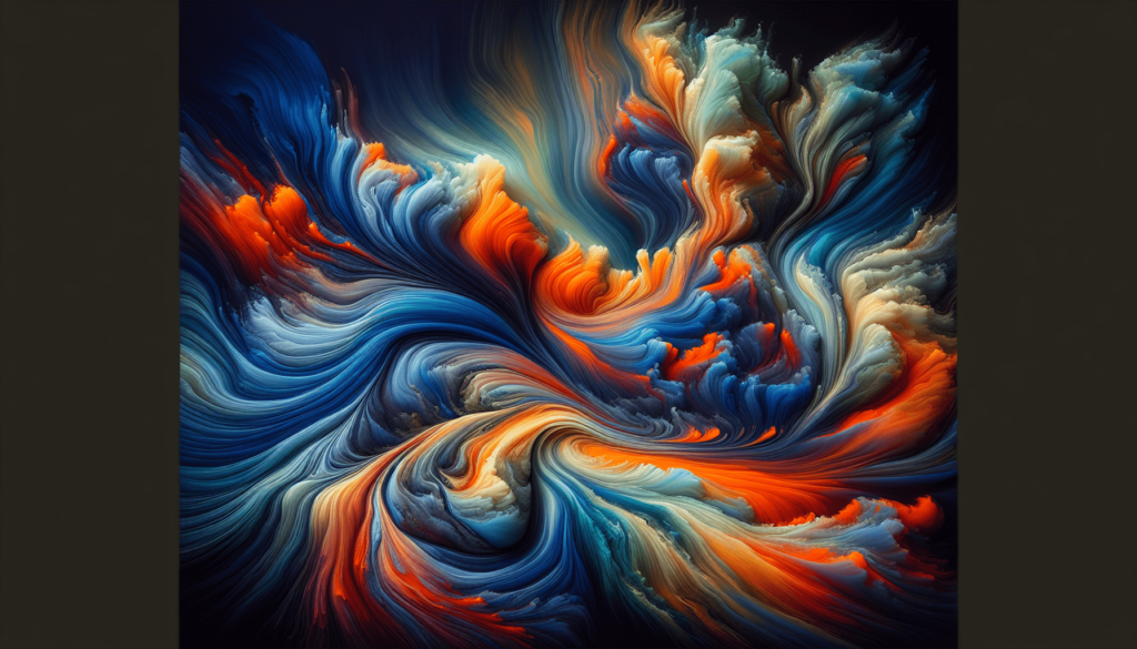
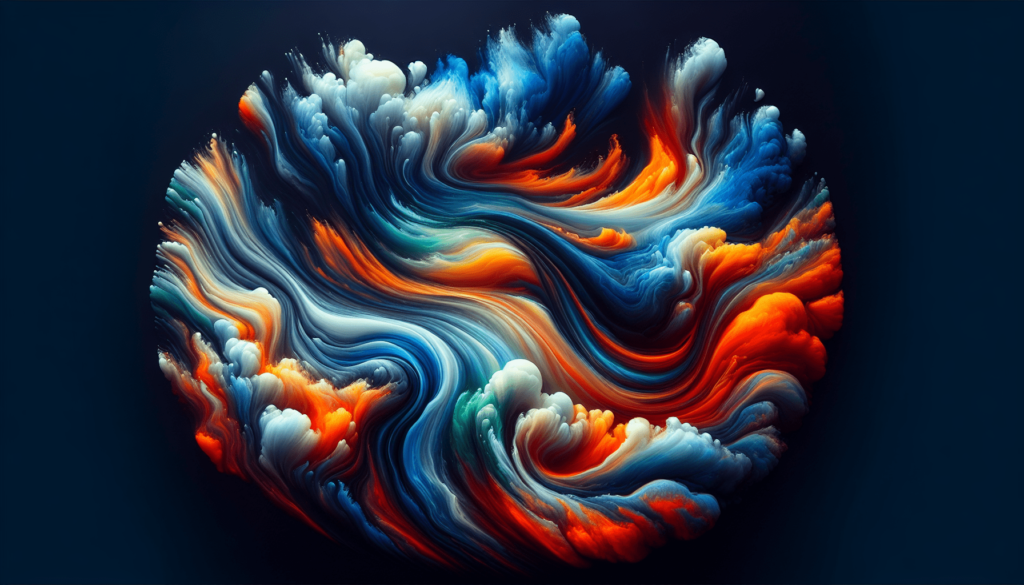
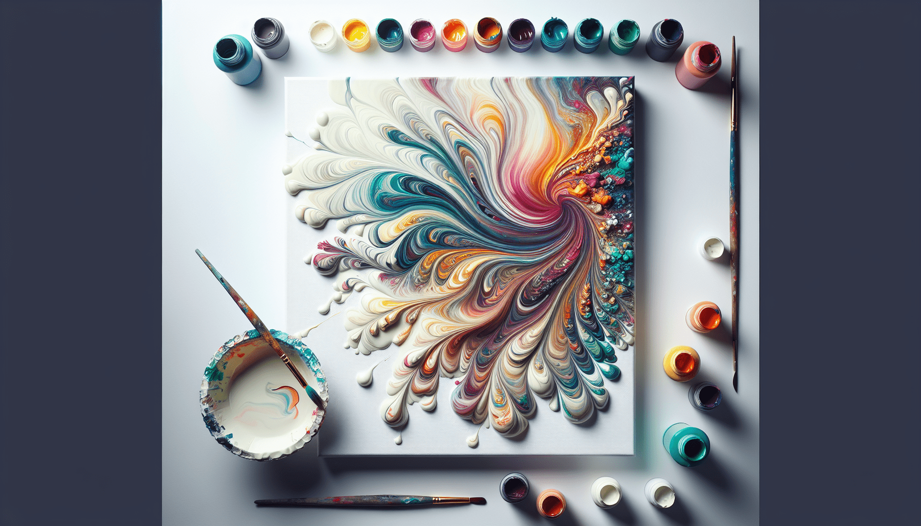
Have you ever wondered what color combinations could breathe life into your next paint pouring project?

Introduction to Paint Pouring
Paint pouring is an intriguing art form that combines spontaneity and creativity, allowing you to create unique pieces of art with a sense of movement and fluidity. It involves pouring layers of acrylic paint onto a canvas or any substrate and allowing gravity to mix the colors in mesmerizing patterns. Choosing the right color combinations is crucial in obtaining visually striking results. In this guide, we’ll delve into the optimal color combinations to enhance your paint pouring endeavors.
Understanding Color Theory
The Basics of Color
Before delving into combinations, it’s essential to understand the basics of color theory. At its core, color theory refers to the body of practical guidance to color mixing and the visual effects of specific color combinations. The primary colors are red, blue, and yellow. These combine to form secondary colors: green, orange, and purple. Beyond these, tertiary colors arise by mixing primary and secondary colors, leading to hues like blue-green or red-orange.
Color Wheel Essentials
The color wheel organizes colors in a circle, showing the relationships among them. Complementary colors are opposite each other on the wheel, such as red and green. Analogous colors are side by side on the wheel, like blue, blue-green, and green, creating harmonious designs. Using the color wheel, you can efficiently choose aesthetically persuasive combinations.
Factors to Consider in Color Combination Selection
Mood and Emotion
Colors evoke emotions and set the tone of your artwork. For example, warm colors like red and orange can convey energy or passion, while cool colors such as blue and green often evoke calmness or serenity. Depending on the mood you wish to express through your paint pouring, selecting colors that align with these emotional representations is pivotal.
Paint Quality and Type
Not all paints behave the same way in pouring applications. Acrylic is the most common choice due to its flexibility and vibrancy. It’s essential to use high-quality acrylics to ensure constant flow and vivid colors. Some colors may appear differently when dry, so trying and observing various hues is advisable.
Contrast and Harmony
The balance between contrast and harmony can significantly influence the visual impact of your artwork. Contrasting colors, like those on opposite sides of the color wheel, can create a dynamic effect. In contrast, analogous colors provide a smooth transition without harsh contrasts. Creating visual interest lies in blending contrast and harmony effectively.
Recommended Color Combinations
Classic Combinations
- Red, Yellow, and Blue: A primary triad that offers a vibrant energy, perfect for bold and dynamic pieces.
- Orange, Purple, and Green: This secondary triad can give depth and richness, creating a harmonious yet striking appearance.
Contemporary Combinations
- Teal, Coral, and Mustard: A modern blend that provides freshness and brightness, giving a modern twist to traditional favorites.
- Lavender, Mint, and Peach: Soothing and elegant, an excellent choice for creating calm and aesthetically pleasing designs.
Monochromatic Schemes
A monochromatic scheme focuses on variations of a single color. For instance, using various shades and tints of blue can create depth while maintaining simplicity. This approach is beneficial for beginners as it reduces the complexity of color choices.
Neutrals with a Pop
Combining neutral tones like gray, white, or beige with a bright pop of color (like cobalt or magenta) can create balanced compositions. The neutrals provide a canvas that makes the pop color more dynamic and eye-catching.

Techniques in Paint Pouring
Dirty Pour
The dirty pour technique involves layering various colors in a single cup, which is then poured onto the canvas. This method emphasizes organic blends and unpredictable outcomes, making color selection crucial so they meld beautifully instead of resulting in muddy mixtures.
Flip Cup Technique
In the flip cup method, a cup filled with different layered paints is quickly flipped onto the canvas. After lifting the cup, the colors spread and intermix in intricate patterns. For optimal results, consider using colors with significant contrast to highlight the swirls and dynamics.
Tree Ring Pour
The tree ring pour creates concentric rings by slowly pouring paint onto a tilted canvas. Here, smooth transition colors work best, such as analogous color schemes, to create soft and mesmerizing patterns.
Swipe Technique
The swipe technique requires pouring colors onto the canvas and using a tool (like a palette knife) to “swipe” across the surface. This technique achieves dynamic streaks; therefore, combining vibrant colors with dark ones can produce dramatic contrasts.
Tips for Successful Color Combinations
Test Small Swatches
Before diving into a large project, test your chosen colors on small canvases. Swatches enable the observation of how colors react with each other and how they appear once dry.
Layer Strategically
How you layer colors matters. Instinct might suggest layering colors randomly, but placing lighter colors between darker ones often prevents muddying, while pure whites can break up vivid colors, enhancing contrasts.
Consider Mediums and Additives
Additives like pouring mediums can affect the flow and finish of your paints. They can make some colors more vibrant or change texture. Mediums filled with silicone may even introduce stunning cells within your art piece. Experiment with different mediums to find one that complements your selected colors best.
Account for Transparency
Acrylic paints vary in transparency. Knowing which are opaque and which are transparent can guide your layering strategy. Transparent paints tend to showcase the underlying colors more vividly, allowing for stunning blending effects.
Common Pitfalls in Paint Pouring Color Selection
Over-mixing
Over-mixing colors within the cup can lead to unintended brown and muddy shades. Achieving a striking result lies in lightly mixing the colors, allowing them to maintain their integrity when poured onto the canvas.
Ignoring Drying Effects
Colors might appear different dry compared to wet. Some hues darken or fade as they dry. Keeping a color chart with swatches of dried paint can guide you in choosing hues that maintain their beauty post-drying.
Conclusion
Color is the lifeblood of paint pouring, dictating the character and vibrancy of your artwork. From understanding color theory basics to successfully employing various pouring techniques, mastering the art of selecting and combining colors enriches your creative expression. By considering emotive aspects, technical considerations, and aesthetic goals, you can craft awe-inspiring art pieces that both captivate and resonate. Remember, the paint pouring journey is as much about exploration as it is about precision. Happy painting!


